Redesigning Carbon’s loan dashboard so a limit cut explains itself.
*This is an unsolicited design.
- Role
- UX Designer
- Team
- Solo, unsolicited teardown
- Timeline
- Under 1 day
- Skills
- Loan UXTransparency Design
- Problem
- Loan limit drops come with no explanation, so users can’t tell why it happened or what to do.
- What I did
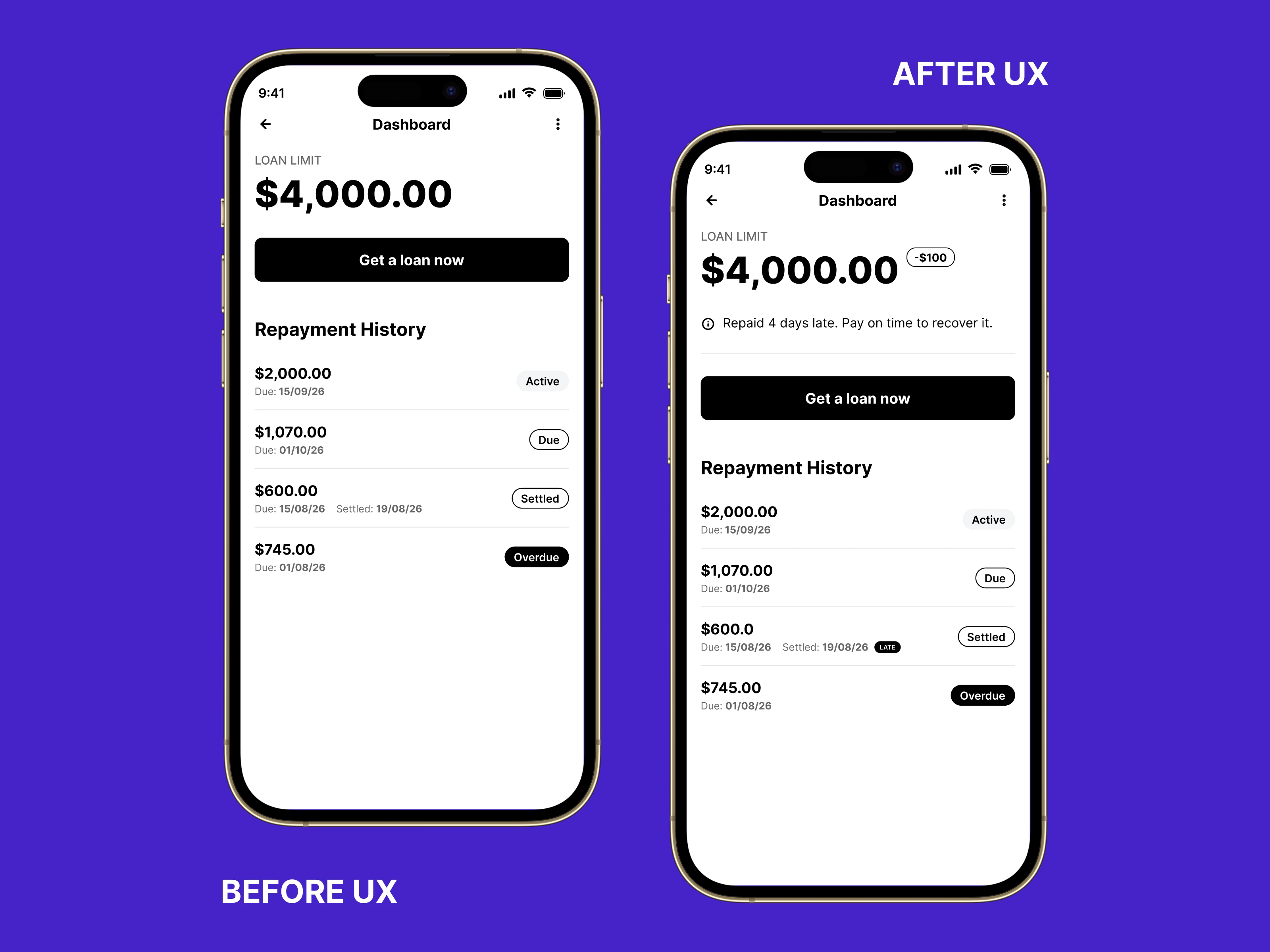
- I added a pill showing how much the limit was reduced, with a short line on why and how to raise it back.
- Result
- Untested and unsolicited, so no real result was measured.
Overview
How do you turn a loan limit cut from a silent penalty into something a borrower can actually trust?
A teardown of Carbon’s loan limit reduction experience.
Solo teardown, prompted by recurring app store complaints about unexplained limit cuts.
The fix: A pill on the limit shows how much was removed, plus one line on why it dropped and how to raise it again.
Problem
Loan limit drops come with no explanation, so users can’t tell why it happened or what to do.
What I noticed: Found in user reviews.
Why it matters (hypothesis, untested): Users feel confused when their limit drops. The question in their head is “why did my limit just drop?”
Evidence
- App index listing of Carbon on Google Play showing a 4.4 review score, checked 29 Oct 2026: https://index.interceptd.com/detail/app/com.lenddo.mobile.paylater (opens in a new tab)
- Nairametrics, Aug 2022, “Review: Carbon is a great loan app but has issues with recent update”, which quotes three users reporting reduced loan limits or denied top-ups: https://nairametrics.com/2022/08/23/review-carbon-is-a-great-loan-app-but-has-issues-with-recent-update/ (opens in a new tab)
Constraints
Solo, unsolicited teardown, done in under a day.
Decisions
What I changed
- Added a pill showing how much the limit was reduced.
- Added one line on why it dropped.
- Added a line on how to raise it back.
Decision
01
- What I chose
- A limit deduction badge on the number itself. The dashboard shows the exact amount removed (-$100) directly next to the loan limit.
- What I rejected
- A warning icon next to the limit. It cluttered the UI.
- Why
- The change is visible at a glance, not just explained in a sentence someone might skim past.
Final screens

Before and after
After the redesign, a pill shows how much the limit was reduced. One line says why it dropped. One line says how to raise it back.
Outcome and status
Untested and unsolicited. I have no data from Carbon, so nothing here is measured.
What I’m unsure about
- I would need interviews to understand exactly how users feel, and a walkthrough of exactly how the app handles limit reductions, not just reviews.
How I would test it
- Release it to a small group of users first.
- A 50% drop in loan-limit complaints reaching support would tell me it worked.
What I would do differently
I would start with interviews and a walkthrough of how the app handles limit reductions, then design. This version started from reviews alone, and I built it in under a day.